APAMSA Website Redesign
Case Study
Need for a professional online presence and usable website
As a national organization of medical and pre-medical students, APAMSA is committed to addressing the unique health challenges of AANHPI (Asian American, Native Hawaiian, & Pacific Islander) communities.
APAMSA’s biggest challenge with their existing website were the lack of usability and visual appeal. Members found the website confusing to navigate and the national board found it laborious to maintain.
CLIENT
Asian Pacific American Medical Student Association
PROJECT SCOPE
UX + UI
User Research
Information Architecture
Wire Framing
Visual Design
Wordpress Website
TOOLS
Adobe Creative Suite, Wordpress
DATE
2021, 2022
CREDITS
Helen Lin (Video Editor)
Understanding Organization Goals
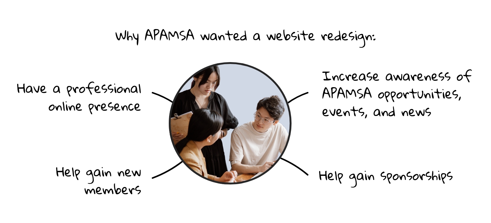
A deeper dive into APAMSA’s objectives shows that the website redesign fit in the context of their long-term goals to grow as an organization that make meaningful impact and connect beyond their medical student members to the full spectrum of healthcare leaders.
Understanding User Needs
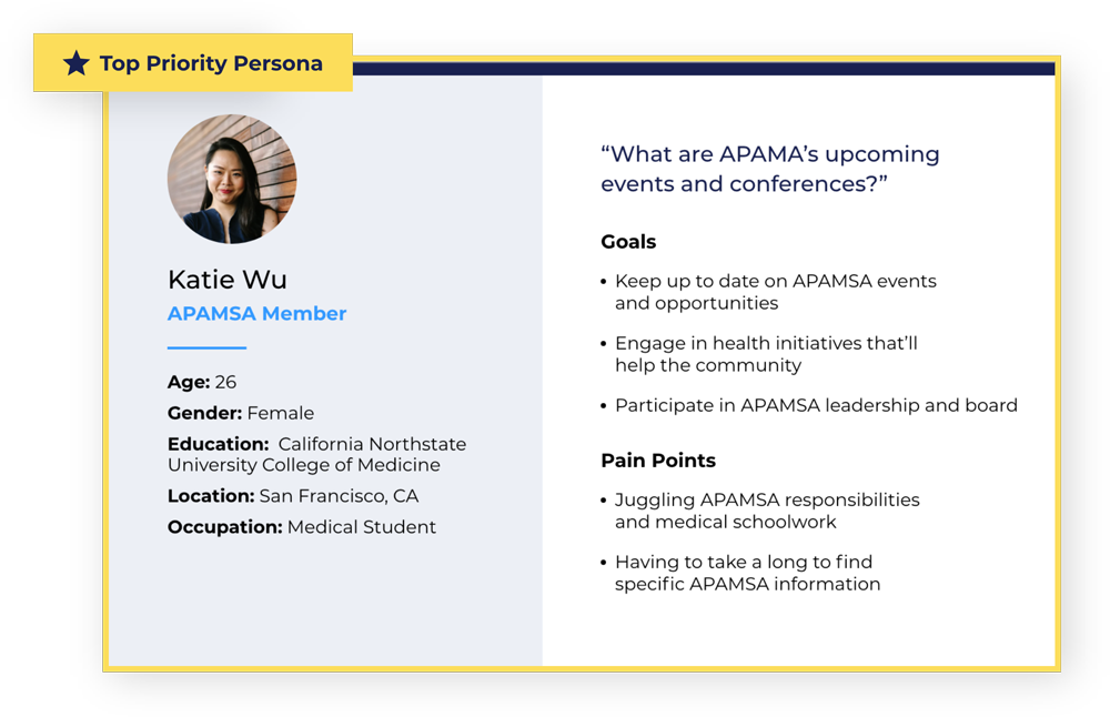
APAMSA wants to prioritize their 4,500+ members as the main users of the website. However, it is also helpful to identify and differentiate other users who would visit the website that will affect APAMSA. Other users included pre-med/medical students who will be interested in joining, health organizations who can provide sponsorship, and alumni who are part of APAMSA’s advisory board.
Personas in order of priority:
- Pre-med/Medical Student Member
- Pre-med/Medical Student Non-Member
- Medical Organizations/Sponsors
- Alumni
Google Analytics Takeaways
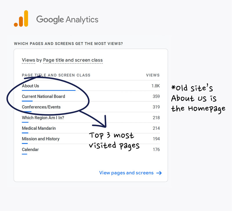
- Users need to check up on APAMSA conferences and events on their website
- Users are interest finding out who’s on the National Board and possibly their contact emails
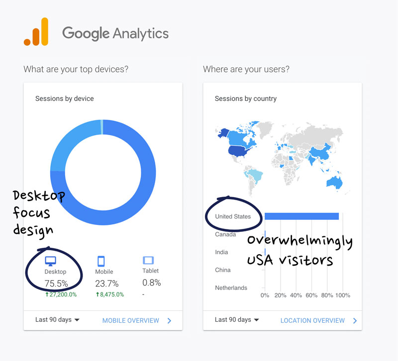
- Users visit the website on their computers the most
Takeaways
- Users need to check up on APAMSA conferences and events on their website
- Users are interest finding out who’s on the National Board and possibly their contact email
- Focus main efforts on desktop design
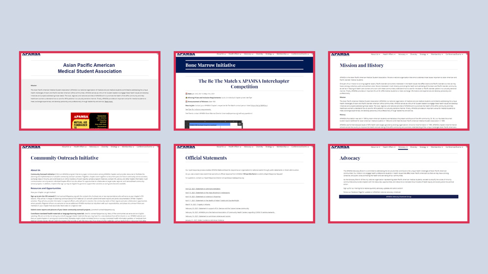
Performing a UX & UI Audit
A review and analysis of the existing website and its content to pinpoint problem areas and solutions.
Examples
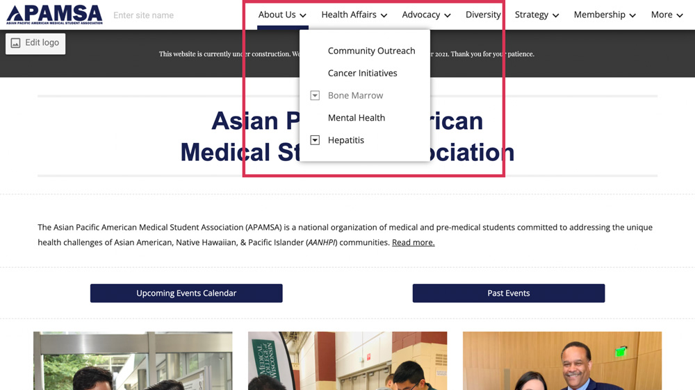
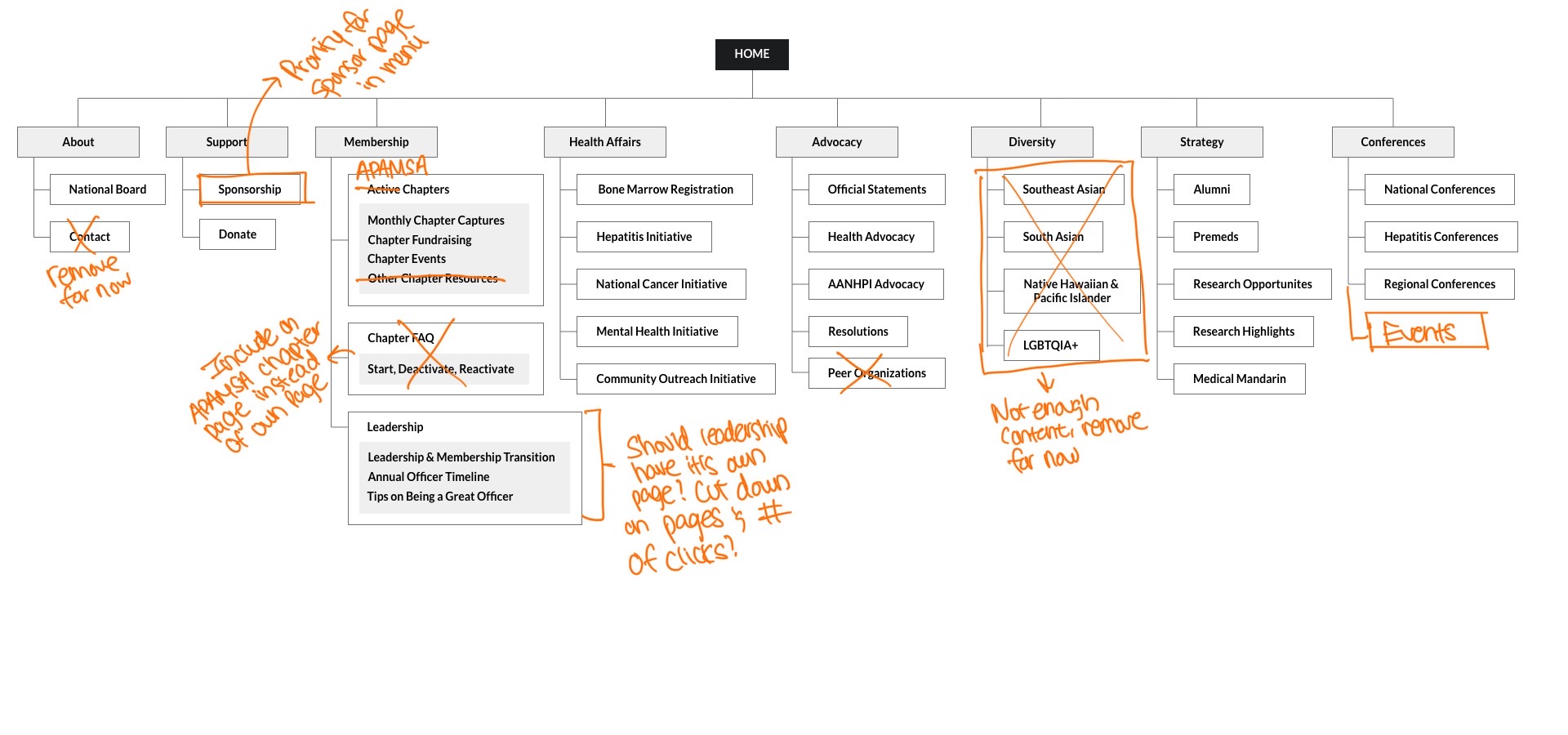
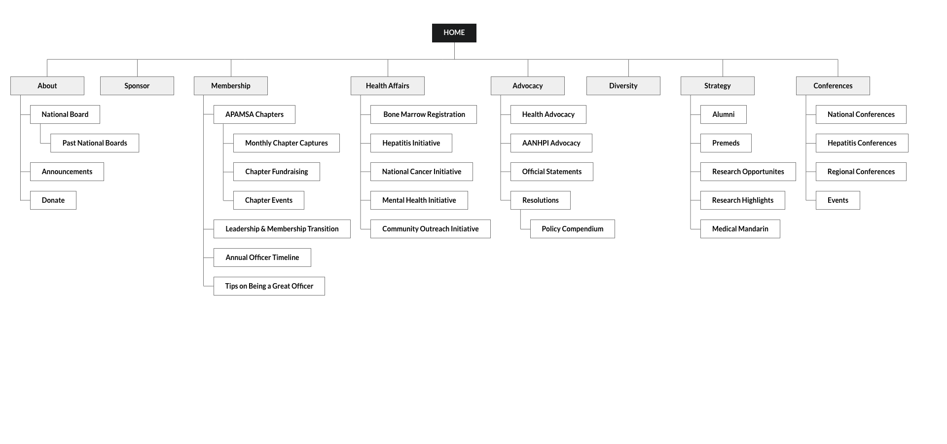
Restructure and prioritize only important pages for the menu and add rest of the pages to the footer for easy access. Menu has too many pages and levels of nesting, that would be especially confusing for non-members.
Rework content organization and hierarchy, while adding in APAMSA photography and design elements to fix confusion from lack of organization, hierarchy, and imagery.
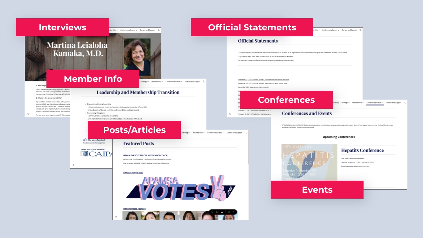
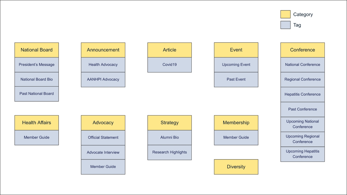
Shift from pages to a “post system” to organize recurring content/pages such as interviews, official statements, past conferences, etc. These pages are often scattered throughout the site without headings, breadcrumbs, or tags making it difficult to know where you are on the site.
Fix page length extremes where there are pages that are too long with too much scrolling and pages that are too short from lack content.
Designing with Limitations in Mind
The new website design must be simple enough to be managed by a APAMSA member, who might not have a web development or design background. Easy maintenance of the website when redesigning the website is taken into consideration.
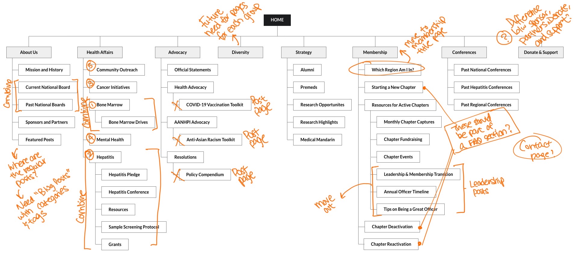
Navigation & Sitemap Organization
The organization is divided between different branches that operate independently. APAMSA leadership prefers to keep each branches’ page (Membership, Health Affairs, Advocacy, Diversity, Strategy) in the menu for direct access.
Post System Taxonomy
After content review, a list of what should be post pages are consolidated. Post categories and tags are determined to label the different type of content APAMSA had. There is a need for clear identification on what would be considered as “announcements, articles, conferences, events, guides, and etc.” for better organization of both existing and future content.
Visual Direction that Matches APAMSA’s Vision
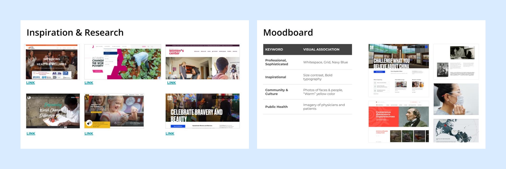
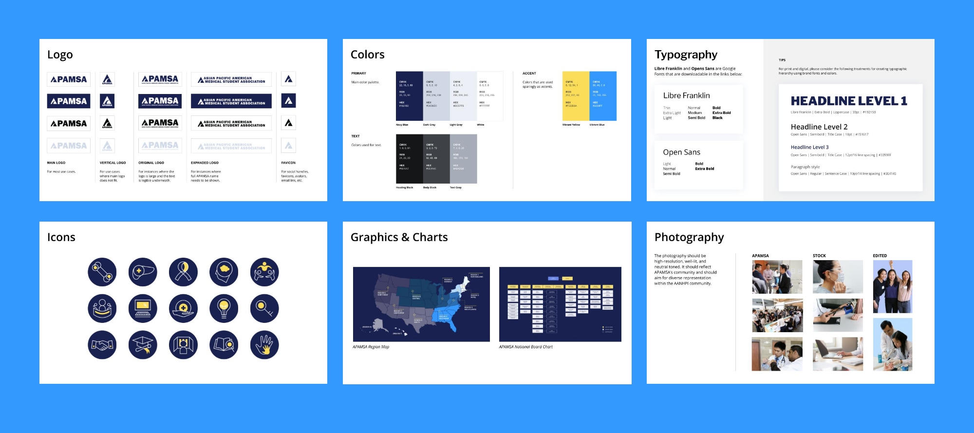
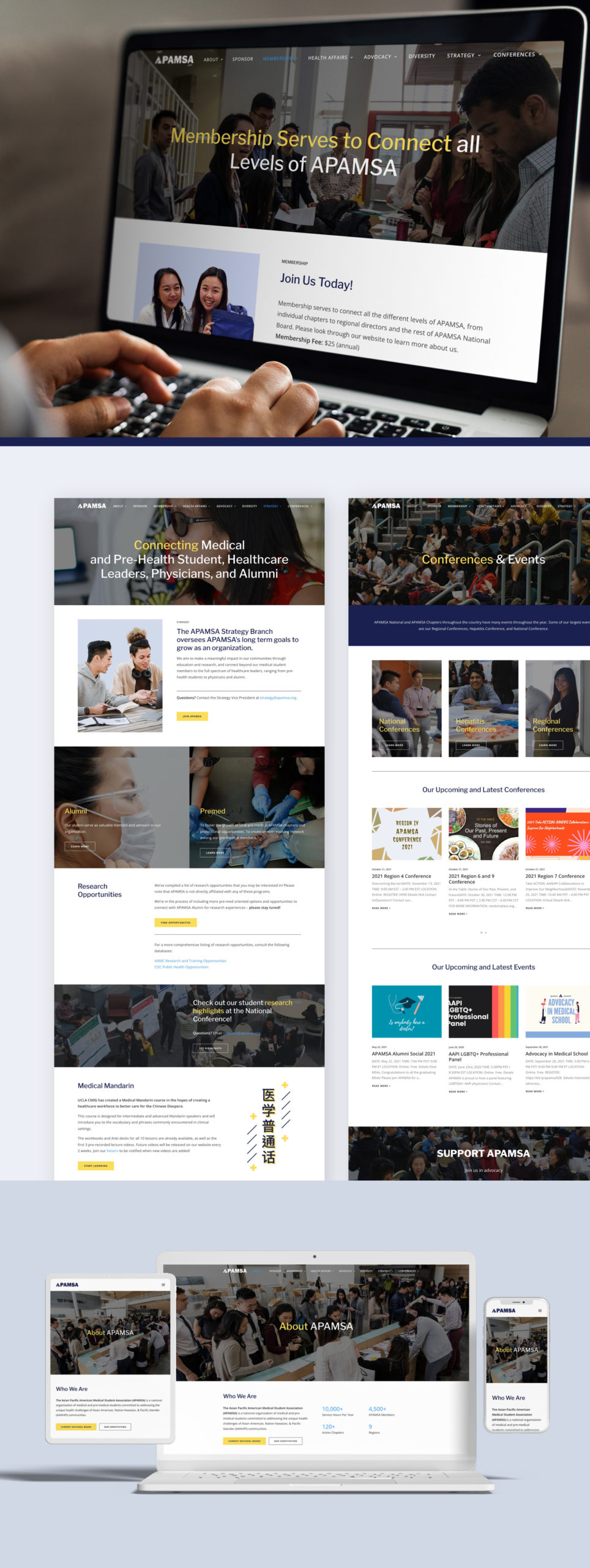
APAMSA’s brand style is elevated upon for a fresh, new look for the website redesign. Research into other non-profit and health organization websites is taken in consideration for the visual direction. The ample use of photography in the redesign is used to showcase APAMSA’s vision and community. It visually highlights what APAMSA has done over the years and their members who were part of it.
From Sketch to High Fidelity Design
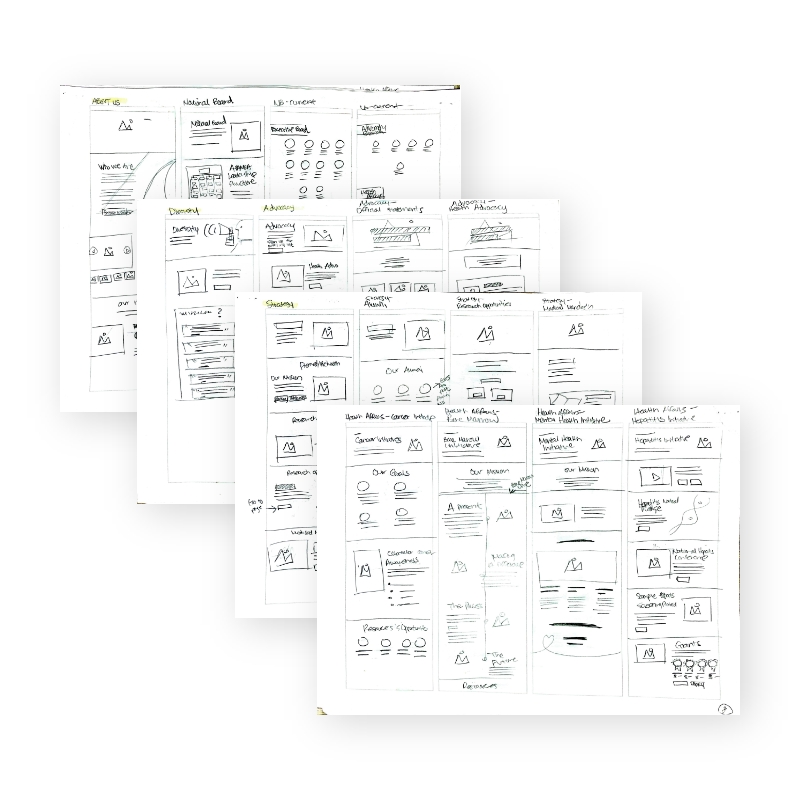
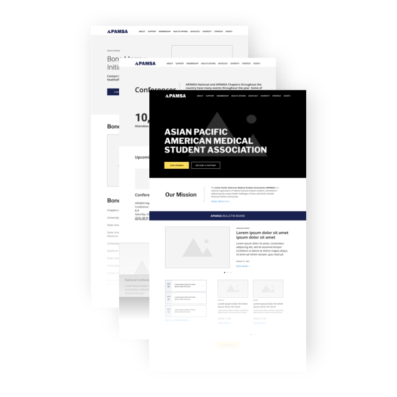
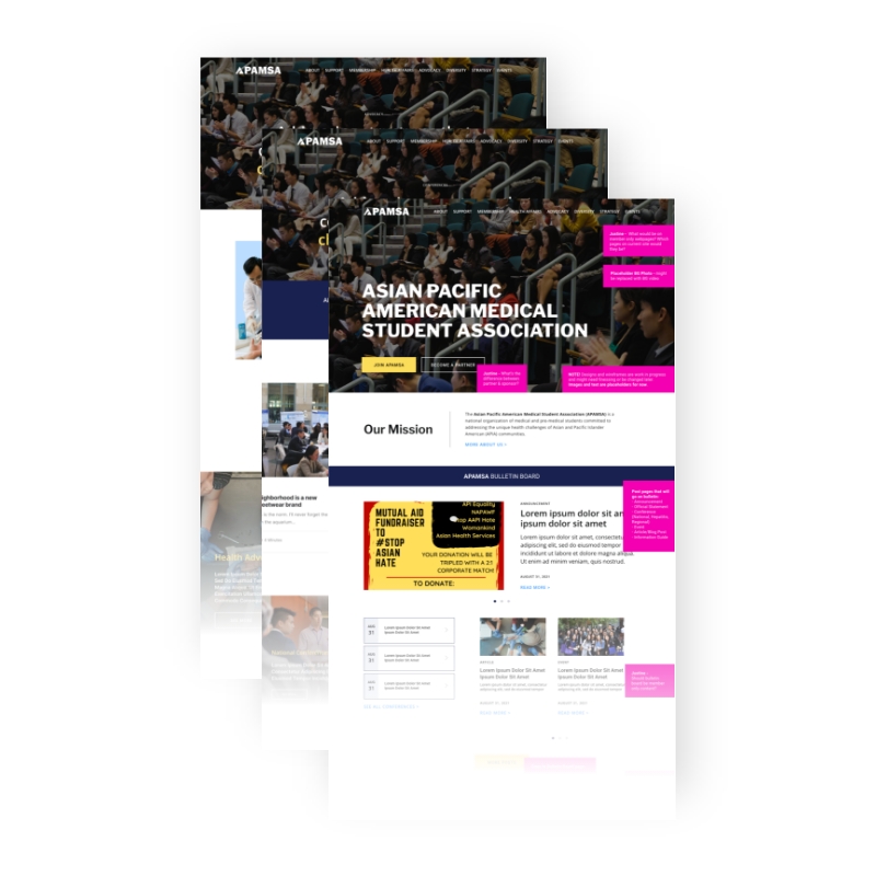
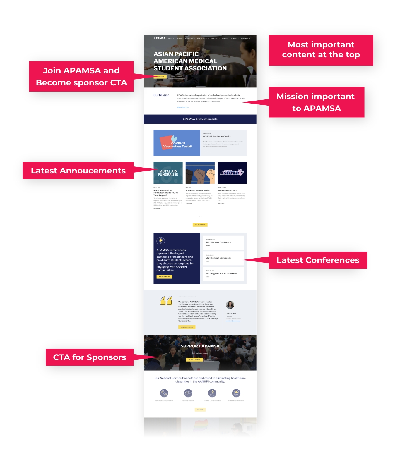
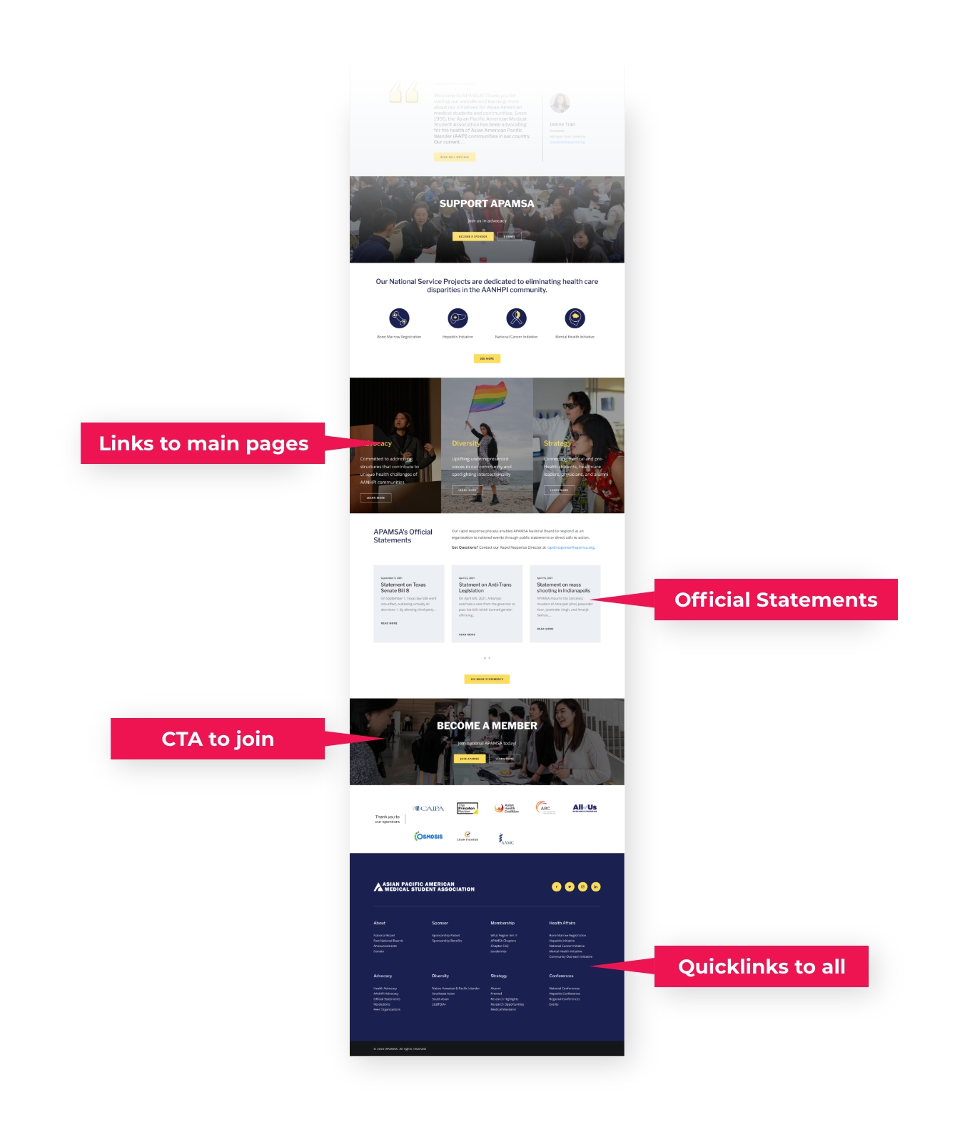
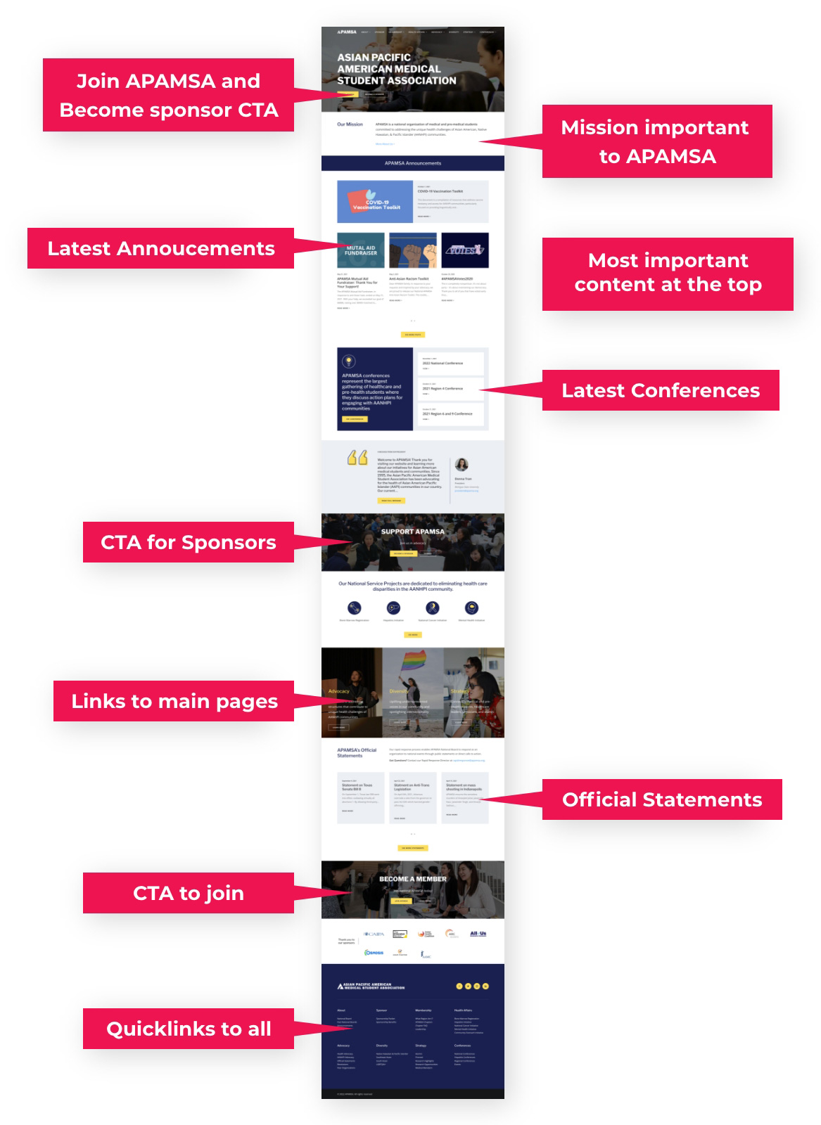
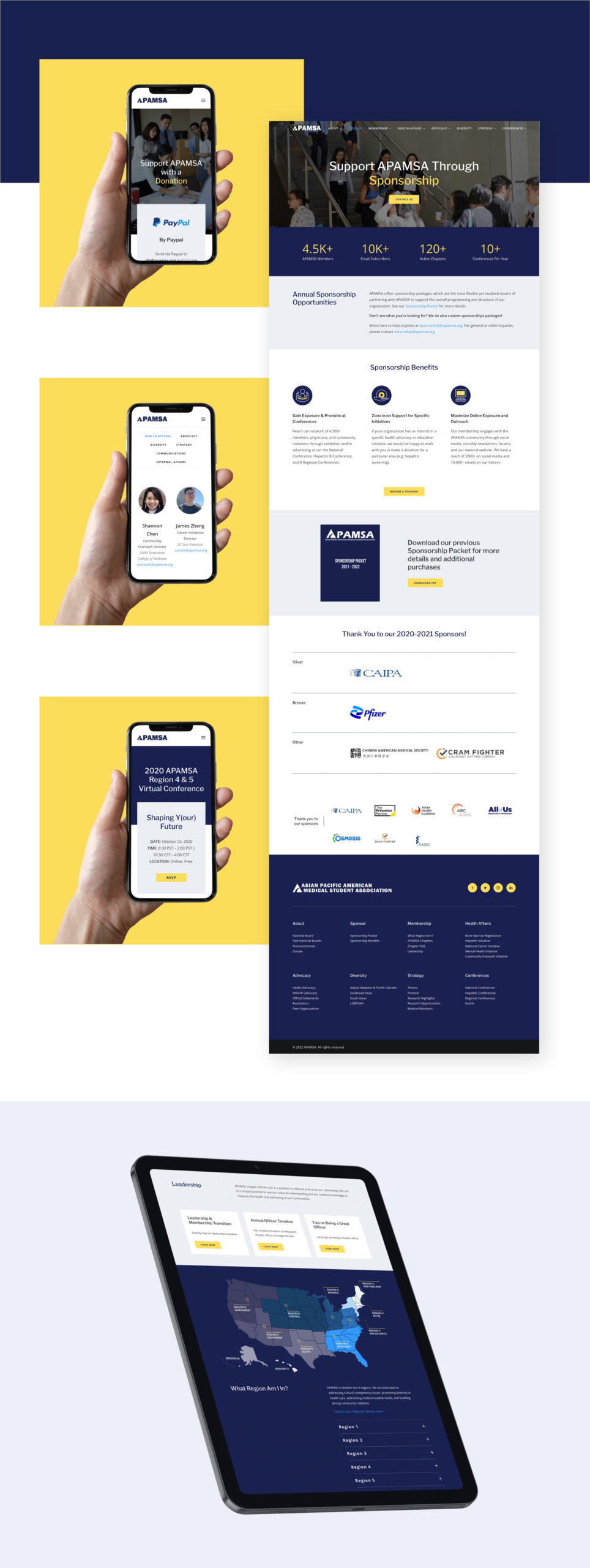
Quick wireframe sketches of all the main pages provided the “big picture” insight that the membership section requires the most reorganization. Layout and hierarchy are flushed out with digital wireframes, and then elevated to high fidelity UI designs.
Sketches
Wireframes
Designs
Incorporating User Feedback
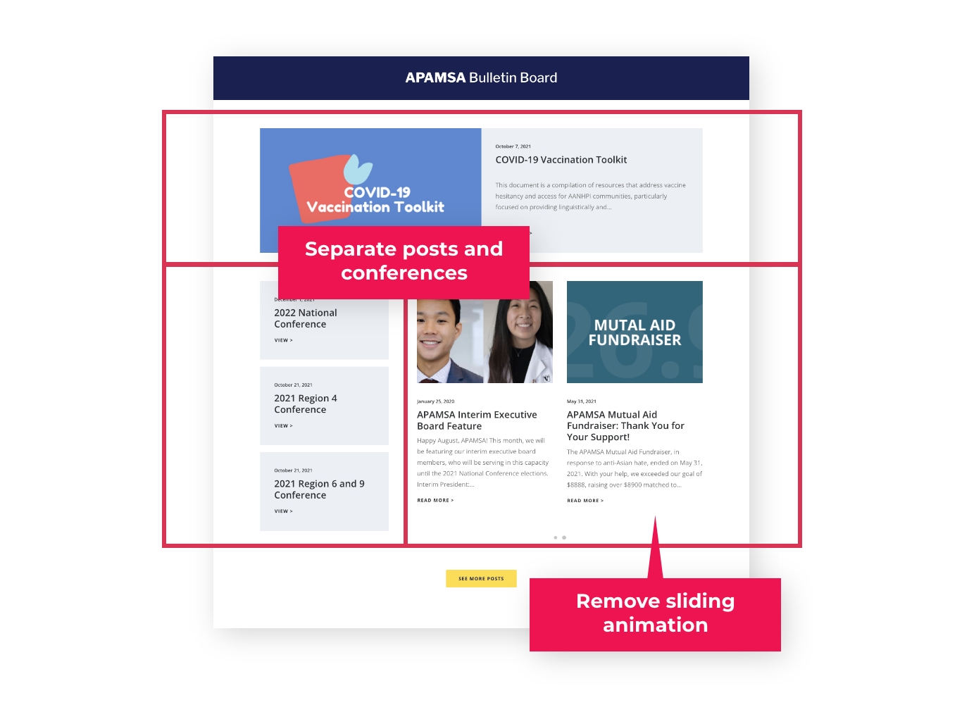
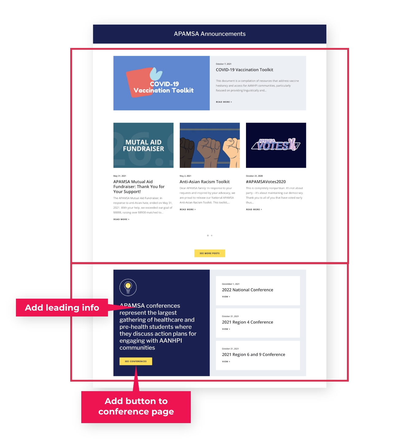
Based on user feedback, iterations and adjustments of the designs are made. A prominent feedback made indicated that the bulletin board on the homepage was “…confusing the way it is formatted— top announcement, left column of 3 posts, and right rotating posts. Too many things going on at once.” To resolve this, announcement posts are separated from conference posts and carousel animation is removed.
Version 1
Version Final
The Final MVP
The strategy for the project was to combine design-thinking and lean UX frameworks to quickly produce MVP of the new site while empathizing with APAMSA member frustrations. The outcome? A new website that reflects a professional look and feel and provides a better user experience, increasing user visits and enjoyability.
"We went from a text-heavy website to a phenomenally designed and professional platform... we received praises from numerous board members, and our website usage and views have increased significantly."
Justine Ku
National Network Director, APAMSA 2021-22
User Satisfaction Survey
Based on user satisfaction survey with the new website in comparison with the previous website:
87%
Average increase in user satisfaction
The breakdown:
- 58% increased satisfaction in usability
- 148% increased satisfaction in visual design
- 101% increased satisfaction in structure & organization
- 70% increased satisfaction in finding info. easily
- 60% increased satisfaction in clarity of content
What's Next?
- Iterating on the website MVP based on further user testing and feedback
- Developing designs further for “Bulletin Board”, conferences, events, etc.
- Developing the membership section of the site so it can act as an information, news, and social hub for APAMSA members
